 MegaMegaTypeType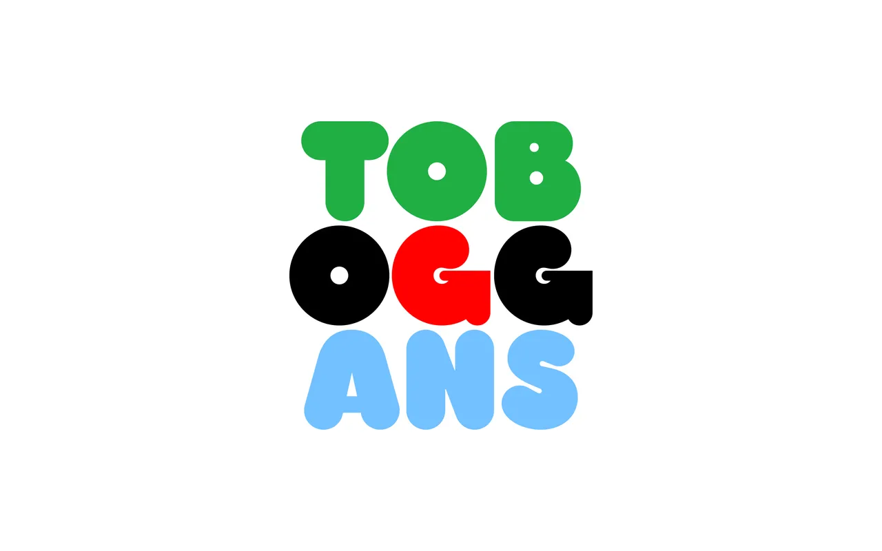
A revival of William Bill Seifert's 1970s 'Too Much' phototype face, redrawn with adjusted weights, curves and proportions to sit alongside — but distinctly apart from — the better-known Frankfurter.
About
Harry takes its cues from the VGC foundry's 'Too Much', an alternative to Frankfurter that offered greater stroke contrast and more idiosyncratic capital letterforms. Eliott Grunewald's interpretation stays close to the original while refining the weight distribution, curves and proportions. The result is a single-weight all-caps display face with the characteristic inflated warmth of 1970s commercial lettering, covering an extended Latin character set.
Classification
A capitals-only display typeface in the rounded, inflated style of 1970s phototype lettering, closely related to Frankfurter and its contemporaries. Its high stroke contrast and unexpected letterform decisions distinguish it from the more mono-linear Frankfurter tradition.