 MegaMegaTypeType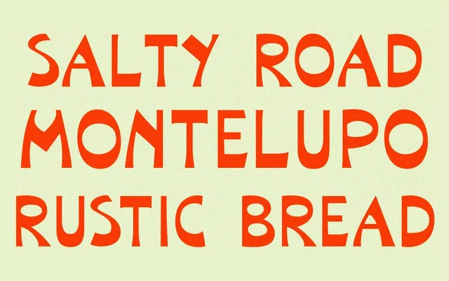
A bold, reversed-contrast display typeface revived from an unnamed hand-lettered alphabet in John Mauritz Bergling's 1914 'Art Alphabets and Lettering', supplemented with a full lowercase, figures and Western European diacritics.
About
The uppercase forms are drawn directly from page 55 of Bergling's 1914 lettering compendium, with weight redistribution to improve rhythm across running text. A lowercase set, numerals and punctuation were designed from scratch to complement the eccentric original capitals. The result carries a breezy, informal Californian character suited to packaging, editorial headlines and branding work.
Classification
A bold display sans-serif with reversed contrast (horizontal strokes heavier than vertical), drawn from a hand-lettered 1914 source alphabet. The exaggerated weight distribution and funky proportions place it firmly in the display category.