 MegaMegaTypeType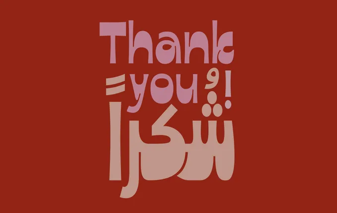
A bilingual Arabic and Latin display font inspired by the hand-lettered title of a 1975 Egyptian film, built around a reversed contrast style with a pronounced handcrafted character.
About
The Arabic design, conceived by Egyptian designer Abdelrahman Farahat, draws directly from the original movie poster lettering of Gnoon Al Shabab, with its notably thick horizontal baseline and strong visual presence. A matching Latin was then developed by the Tarek Atrissi Design team to share the same reversed contrast logic and handcrafted quality. The high contrast between strokes makes it well suited to large-scale applications such as editorial headers, poster design, branding and TV graphics in bilingual contexts.
Classification
A display typeface with a distinctive reversed contrast style — thick horizontal strokes dominating over thin verticals — inspired by 1975 Egyptian movie title lettering, covering both Arabic and Latin scripts.