 MegaMegaTypeType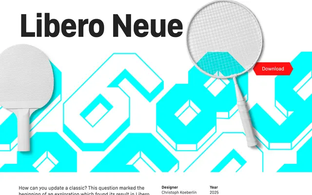
A refined update to Sportsfonts' Libero, tightening the letterforms and adding a negative variant and heavier styles for smaller applications.
About
Libero Neue modernises the shapes of the original Libero while preserving its classic football aesthetic, resulting in a more contemporary yet true-to-tradition display face. A negative variant and thicker-line styles extend its usability across different scales and applications. The design aims to balance nostalgia for the sport's heritage with a cleaner, more versatile execution.
Classification
A display typeface in the tradition of football/soccer lettering, with bold, upright forms and a negative variant. The tight, refined letterforms and sport-specific aesthetic place it firmly in the display category.
Weights
RegularThick
Languages
Latin
Tags
sportsfootballdisplayboldnegativecontemporaryretrolettering