 MegaMegaTypeType
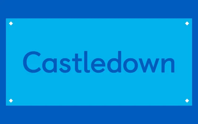
A typeface commissioned by Castledown Primary School in Hastings and developed between 2012 and 2014 to address the fragmented typography used in primary education across the UK.
About
Developed in collaboration with Castledown Primary School, the design prioritises legibility and clear letterform differentiation – notably between lowercase 'l' and uppercase 'I' – with an understanding of how handwriting is taught built into its structure. Three weights (Regular, Bold and Heavy) each have corresponding Italic and Fun variants, plus a dotted stylistic version, a Cursive script variant and Instructional versions for writing practice. The family received a Design of the Year 2014 nomination at the Design Museum and a Premier Award from the International Society of Typographic Designers.
Classification
Designed with primary education in mind, Castledown exhibits humanist sans-serif characteristics with careful attention to letterform differentiation, making it legible and pedagogically purposeful rather than purely aesthetic.