 MegaMegaTypeType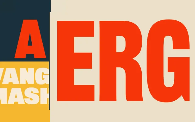
A digital revival of American Type Founders' 1906 condensed gothic, extended from one weight to five and supplemented with a layered shadow family for headline use.
About
Originally cut in metal by ATF in 1906, Railroad Gothic carries the uneven proportions and blunt directness of Victorian industrial typography. This contemporary version interprets letterforms across multiple historical metal sizes, retaining the original's unstudied character while adding four bolder weights with open counters for legibility at large sizes. A three-style shadow subfamily adds layering capability for display work.
Classification
A condensed industrial sans serif revival, firmly in the American gothic tradition. Its tight proportions, even stroke weight and display-oriented construction place it squarely in the condensed gothic subcategory, designed for headline use rather than continuous text.