 MegaMegaTypeType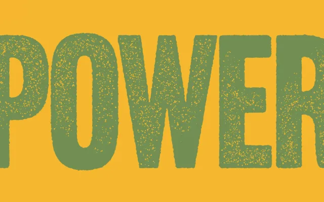
A digitisation of American Type Founders' 1936 bold condensed headline face, offered in five variants including smooth, rounded and roughened treatments that evoke letterpress and wood type printing.
About
Originally cut by Morris Fuller Benton for American Type Founders in 1936, the design draws on the bold condensed gothic display tradition of the 19th century while refining the details beyond what wood type typically allowed. Its most distinctive feature is the high-waisted M, whose short diagonals keep the counter open and avoid the cramped appearance common in similar condensed faces. The digital revival adds a Round style with softened corners and three Rough variants that suggest the texture of worn wood type or ink spread on newsprint.
Classification
An all-caps bold condensed sans-serif with roots in 19th-century wood type gothic display faces. Its single-weight, all-caps character set and tightly condensed proportions place it firmly in the display category rather than general-purpose sans-serif.