 MegaMegaTypeType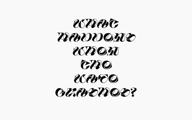
A sharp, angular experimental display face from Carlos Gonçalves with slanted letterforms and a tight 45-glyph set, conceived as a formal exercise in edge and angle.
About
Razor is a single-weight display typeface built around slanted characters with super-sharp edges, extreme angles and occasional wavy forms. Its 45-glyph character set makes it a formal experiment rather than a production workhorse – consistent internal logic holds the family together, but coverage is too thin for extended text. Best suited to short headlines, poster work or motion graphics where an abstract, aggressive personality is the point.
Classification
Experimental display face built on slanted, sharp-edged letterforms with angular and occasionally wavy forms. Single weight. Very limited character set of 45 glyphs (letters, numerals, basic punctuation). Geometric in construction with abstract, unconventional proportions.