 MegaMegaTypeType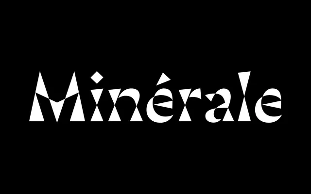
Thomas Huot-Marchand's 2018 display typeface pushes the thinned vertical stem of classical serifs to its geometric limit, collapsing each stem into two triangles joined at their points to create a luminous, almost crystalline stroke structure.
About
Where traditional serifs taper their stems gently, Minérale takes the conceit to an extreme: stems narrow to a single point at the centreline, producing a pronounced hourglass silhouette. Heavier weights tilt toward reversed contrast, with horizontal stress recalling 19th-century Italian typefaces, while the italics rotate around a vertical axis with inclinations ranging from 5° in the lightest weight to 21° at Black. The entire family is multiplexed – all weights share identical advance widths and kerning – and is available as a variable font, the first published by 205TF. It received a Certificate of Excellence from the Type Directors Club in 2018.
Classification
Minérale exaggerates the thinned-stem structure of traditional serif typefaces to an extreme, where vertical stems become two triangles meeting at their tips, producing an effect reminiscent of 19th-century 'Italian' reversed-contrast faces. The result is too structurally radical to sit comfortably in a conventional serif subcategory, placing it firmly in the display/experimental camp.