 MegaMegaTypeType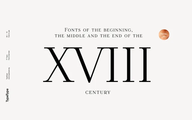
A 20-style collection of display titling serifs drawn from 18th-century book typography, spanning five subfamilies that chart the evolution of Cyrillic and Latin type from the reign of Peter the Great to the end of the century.
About
Each of the five subfamilies anchors its design to a specific historical moment: TT Tsars A references Romain du Roi, B the Russian Civil Type, C the mid-century transition when flat-pen influence lingered in Cyrillic forms, D the leaner geometry of late-century printing, and E a speculative Latin extrapolation of the Grazhdansky type. All subfamilies share a common skeletal framework, onto which period-appropriate stylistic details were layered. Small capitals stand in for lowercase throughout, with rich OpenType support including discretionary ligatures for both Latin and Cyrillic.
Classification
A display titling serif drawing on 18th-century book title page typography, with five subfamilies each evoking a distinct period or stylistic source including Romain du Roi and Russian Civil Type. Small capitals replace lowercase, confirming its display-only orientation.