 MegaMegaTypeType
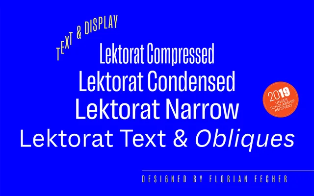
The six reading styles of Florian Fecher's Lektorat, a grotesque with deep ink traps built for magazine text.
About
Lektorat Text keeps the editorial family's body copy to six styles: Regular, Semibold and Bold with obliques. Its raised shoulders, deeply cut junctions and asymmetrical counters come from Schelter & Giesecke grotesques of the early 1900s. An alternate k and K and a tail-less a are the only stylistic sets, and variable fonts are available. It won the Gerard Unger Scholarship in 2019.
Classification
The text subfamily of Lektorat: a grotesque sans for reading sizes with raised shoulders, deep incisions at highly contrasted junctions and asymmetrical counters, after Schelter & Giesecke grotesques of around 1900.
Weights
RegularSemiboldBold
Optical sizes and widths
Text
Languages
Latin
Tags
editorialmagazinegrotesquetextpublishingvariablesans-serif