 MegaMegaTypeType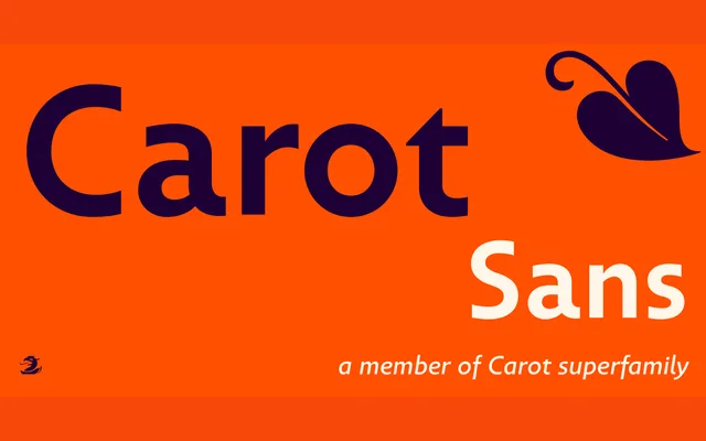
A grotesque originally drawn for tired eyes, now a favourite with publishers.
About
Carot Sans was originally designed for a fading vision but has since become a go-to text sans for publishers. Eight weights with italics give it plenty of room to move between body copy and headline work.
Classification
The grotesque branch of the Carot family, built for extended reading.
Weights
ThinExtra LightLightRegularMediumBoldExtra BoldBlack
Languages
Latin Extended
Tags
sans-seriftextpublishingfamily-systemreadable