 MegaMegaTypeType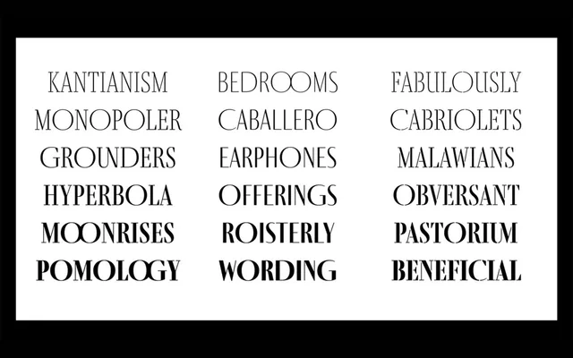
A high-contrast titling sans from Ermin Međedović that strips the Didone genre of its serifs while preserving its most theatrical stroke drama across 24 styles.
About
Fino Sans belongs to the broader Fino type system, which also includes a serif and a stencil counterpart. The family spans two optical registers – a standard cut and a Title cut – each offering six weights from UltraThin to Bold with matching italics. Discretionary ligatures and two stylistic sets extend its expressive range, making it well suited to editorial, packaging and motion work where typographic impact is the priority.
Classification
Fino Sans is a high-contrast titling sans with Didone proportions, pairing extreme thin and thick strokes typical of the Didone genre with the absence of serifs. Its theatrical stroke modulation and titling orientation place it firmly in the display category.