 MegaMegaTypeType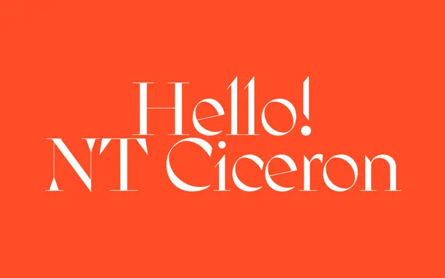
A high-contrast display serif in the tradition of Didot and Bodoni, three years in the making.
About
NT Ciceron pushes stroke contrast to its limit, with diagonal stress that plays thick against thin near the corners of each letter. It's built purely for display sizes rather than text. The foundry describes it as developed over three years across two cities.
Classification
High contrast between thick and thin strokes with diagonal stress, in the tradition of Didot and Bodoni, places this as a didone display face.
Weights
Regular
Languages
Latin
Tags
didonedisplayhigh-contrasteditorialfashion