 MegaMegaTypeType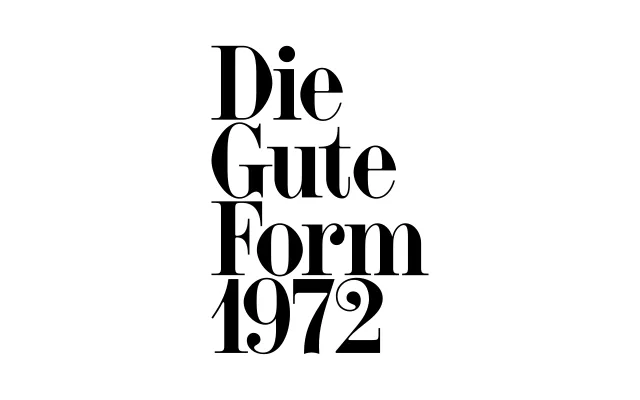
A single-weight condensed didone titling face drawn by Clara Dousson and Alan Madić, departing from a fragmented 1920s G. Peignot & Fils source to construct a denser, more contemporary editorial voice.
About
Originating from an incomplete 1920s Peignot didone restricted to capitals, numerals and signs, Initiale expands the source into a full character set including lowercase informed by tightly set editorial compositions of the 1960s and 70s. Contrast is slightly softened from classical didone extremes, and subtle structural irregularities introduce tension across the line. Enlarged punctuation marks — periods, quotation marks and symbols — function as active rhythmic elements within the typographic system.
Classification
A condensed, high-contrast didone titling typeface rooted in neoclassical tradition, with extreme stroke contrast typical of fat-face and Didot-lineage designs. Its compressed proportions and display-only weight place it firmly in the display category rather than general-purpose serif.