 MegaMegaTypeType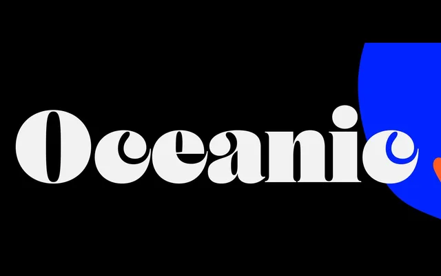
A high-contrast serif rooted in fat face tradition, with creature-like letterform details and a Text subfamily that earn it a place well beyond the headline.
About
Oceanic draws from the upright contrast of 18th and 19th-century fat faces – Bodoni, Canon, Scotch Roman – but pushes into idiosyncratic territory: the c and e suggest prehistoric sea creatures, and the R and K are cut with deliberate tension. A Display variant leans into these qualities at scale; a Text subfamily reduces contrast and condenses slightly for sustained reading. Six weights with matching italics cover Extended Latin and Cyrillic.
Classification
Upright-contrast serif inspired by 18th–19th-century fat faces (Bodoni, Canon, Scotch Roman). Lowercase c and e carry creature-like forms; R and K are drawn with deliberate tension. A Display variant maximises these qualities at scale; a Text subfamily reduces contrast and condenses slightly for continuous reading. Covers Extended Latin and Cyrillic across six weights with matching italics.