 MegaMegaTypeType
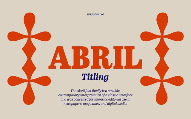
A 32-font headline family extending Abril, with lower contrast and four widths for tight, newsy headlines.
About
Abril Titling was made three years after Abril, when editorial designers asked for a low-contrast face for headlines. Setting letters closer together meant changing the terminals, the weight distribution and the internal spaces, not just the tracking. Four widths, from Regular to Condensed, each come in four weights with italics, so the wider cuts suit smaller callouts and the narrow ones fill cover lines.
Classification
Abril Titling is a low-contrast display serif in the Scotch Roman tradition, engineered specifically for headline use with modified terminals and weight distribution optimised for tight setting across four widths.
Weights
RegularSemiboldBoldExtrabold
Optical sizes and widths
RegularNarrowSemi-CondensedCondensed
Family
Abril Titling NarrowAbril Titling Semi-CondensedAbril Titling Condensed
Languages
Latin
Tags
scotch-romaneditorialheadlinenewspaperdisplaycondensedworkhorse