 MegaMegaTypeType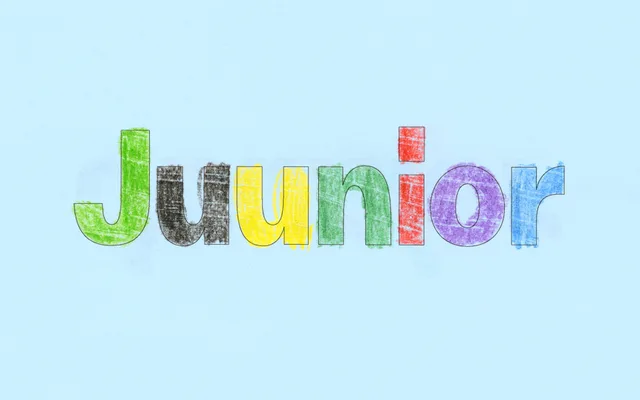
A humanist sans-serif that pairs the contrasted strokes of American Gothic faces with stretched, egg-like proportions, available in six weights with italics and a variable font.
About
Juunior channels the ink-trap sensibility of American Gothics like Franklin Gothic through arched, non-geometric letterforms that read as simultaneously naive and assured. Designed by Andree Paat of Tüpokompanii, it ships with ten sets of stylistic alternates – schoolbook, arched, senior and pointy variants – giving typographers real range within a single family. The technical build is solid: 700 glyphs covering Latin and Cyrillic, kerning by Igino Marini, and full variable font support across the weight axis.
Classification
Six-weight humanist sans-serif drawing from American Gothic tradition (contrasted strokes, references to Franklin Gothic) combined with stretched, egg-like proportions and non-geometric arched forms. Ships with ten sets of stylistic alternates covering schoolbook, arched, senior and pointy letter variants. Includes a variable font axis. Spacing and kerning by Igino Marini.