 MegaMegaTypeType
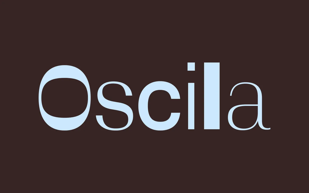
One sans-serif skeleton in six states of stroke contrast, from a near-monolinear Low to a high-contrast High and a reversed-stress Inverse.
About
Designed by Jordi Embodas, Oscila keeps the same build across six families and changes only how the stroke is weighted. Low, Mid and High step up the contrast in the usual way; Fine is High with terminals that stay thin, Central keeps the high contrast only in the middle of the letters, and Inverse moves the weight onto the horizontals. Each family runs from Hairline to Black in seven weights with italics, and the system also comes as variable fonts with weight and contrast axes.
Classification
A sans-serif system in which one skeleton is drawn with six kinds of stroke contrast: Low, Mid and High rise in conventional contrast, while Fine, Central and Inverse rework the high-contrast version, the last flipping the stress so horizontals carry the weight.