 MegaMegaTypeType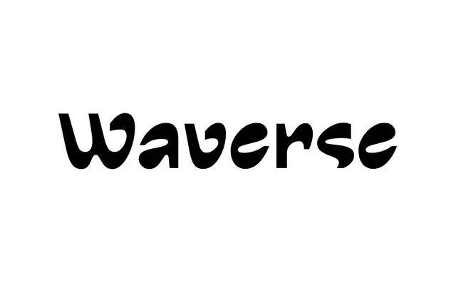
A reverse-contrast display sans with a rounded, wave-like rhythm and two named italics, Breezy and Windy.
About
Waverse inverts the usual thick-thin logic of reverse-contrast type, using filled-in a and e shapes and cut-off g and s to keep an airy, open feel rather than the cramped look common to the genre. It ships as Regular plus two italic angles, Breezy and Windy, alongside a variable font that lets the slant move between them. Built for branding at large and medium sizes rather than running text.
Classification
Reverse-contrast structure, thick stems against fine curves, places Waverse outside standard sans-serif convention, in its own reverse-contrast display subcategory.
Weights
Regular
Languages
Latin Extended
Tags
reverse-contrastdisplaybrandingplayfulvariable