 MegaMegaTypeType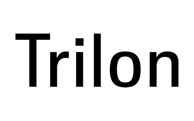
An 80-font grotesque sans across four widths and ten weights, drawn to avoid both the droopy shoulders of American Gothics and the fatigue of European ones.
About
Trilon was built at the request of a friend tired of the droopy shoulders in American Gothic sans faces and equally tired of the European Gothics. The result carries a subtle squareness without becoming a full geometric design, across ten weights and four widths, regular, compressed, condensed and expanded, all with obliques. Four OpenType stylistic sets shift the g, a and y between different personalities.
Classification
Designed at a friend's request for something without the droopy shoulders of American Gothics or the fatigue of European Gothics. Carries a subtle squareness without tipping into full geometric severity. Sold across four widths, regular, compressed, condensed and expanded, with four OpenType stylistic sets altering the g, a and y.