 MegaMegaTypeType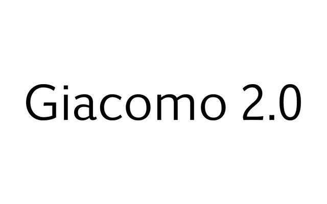
A sans serif that Montalbano deliberately built to dodge the usual geometric, humanist and grotesque boxes, with chamfered corners and cupped terminals that soften at larger sizes.
About
Giacomo 2.0 sits in what its designer calls a familiar yet unique space, neither geometric nor humanist nor grotesque. Chamfered corners and cupped terminals are barely visible at small sizes but add real softness in display use, across six weights from Light to Black with italics. It was Terminal Design's first OpenType release to include Cyrillic.
Classification
Montalbano is explicit that Giacomo 2.0 is a sans serif that resists standard classification, sitting outside geometric, humanist and grotesque models. Chamfered corners and cupped terminals add softness at larger sizes. Notable as Terminal Design's first OpenType design with Cyrillic support. Recategorised here as sans-serif; the original brief's Script label does not match the designer's own description.