 MegaMegaTypeType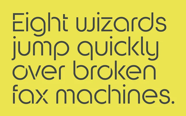
A Bauhaus-inspired geometric sans built on circular forms, with each letterform reduced to the fewest possible strokes in the tradition of Herbert Bayer's Universal Typeface.
About
Designed as a round counterpart to the foundry's square-based Kampen, Kitami takes its cue from Herbert Bayer's 1920s Universal Typeface experiment at the Bauhaus. Rather than a true stencil, the design aims for purity through economy: each character is described by a single stroke or, where unavoidable, the minimum number of strokes. Both upper and lower case sets are included, acknowledging that Bayer's single-case ideal, however principled, was impractical.
Classification
A pared-down, monoline geometric sans inspired by Herbert Bayer's Universal Typeface from the 1920s Bauhaus, built on circular forms with each character described by as few strokes as possible. The minimal, near-stencil construction and display orientation place it firmly in the display category.