 MegaMegaTypeType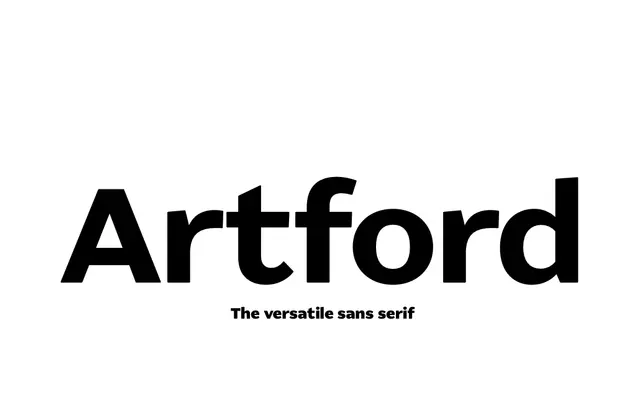
A wide, big x-height grotesque sans with a North American accent, built to work as comfortably in headlines as in small text.
About
Artford runs six weights from Extra Light to Ultra Bold with italics, its generous x-height and gentle rounding at larger sizes giving it a friendlier read than a strict grotesque. Automatic collision-avoidance for lowercase f and j, and a www ligature, are built into the OpenType feature set. One weight, Regular, is available free.
Classification
Artford's grotesque proportions, moderate contrast and wide sans-serif letterforms put it in the grotesque subcategory rather than a geometric or humanist sans.
Weights
Extra LightLightBookRegularBoldUltra Bold
Languages
Latin
Tags
grotesquesans-serifbrandingall-rounderfree-weight