 MegaMegaTypeType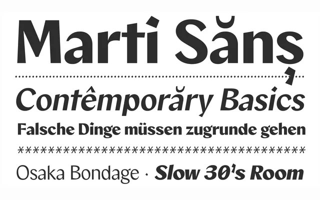
A contrast sans with flat-nib calligraphic touches, designed by Estudio Vástago with a reduced ascender height for readability.
About
Marti Sans reinterprets classic sans-serif contrast with authentic flat-nib calligraphic strokes, its heavier weights showing bold slant and distorted dots while lighter weights keep the same details more subtle. A balanced width supports harmonious composition across both body text and headlines.
Classification
A contrast sans with sturdy touches reminiscent of flat-nib calligraphic strokes, with a reduced ascender height that improves readability.
Weights
ThinExtraLightLightRegularMediumSemiBoldBoldExtraBoldBlack
Languages
LatinLatin Extended
Tags
sans-serifcalligraphicbrandingcorporatevariable