 MegaMegaTypeType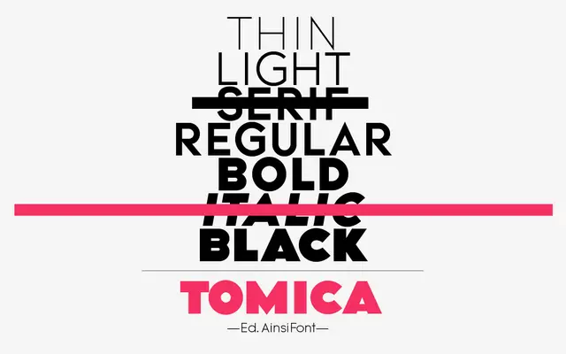
A five-weight geometric sans-serif, originally a digital television channel's identity face, that the designer describes as a Futura descendant.
About
Tomica began in 2009 as the corporate identity face for a digital television channel and was completely redesigned in 2011 before wider release. Its geometric construction openly nods to Paul Renner's Futura, run across five weights from Thin to Black.
Classification
A five-weight geometric sans-serif explicitly described by its designer as a descendant of Futura, redesigned from an earlier television identity face.
Weights
ThinLightRegularBoldBlack
Languages
Latin
Tags
sans-serifgeometricbrandingcorporatefutura-influenced