 MegaMegaTypeType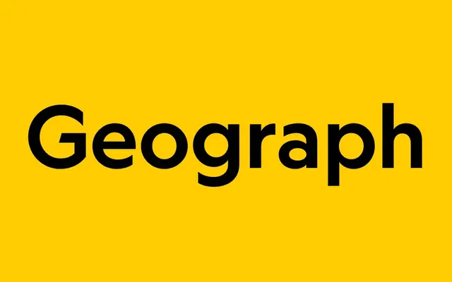
A geometric sans-serif commissioned for National Geographic that mediates between Futura's idealism and Super Grotesk's practicality, with six weights, matching italics, and three stylistic sets for fine-grained tonal control.
About
Geograph was commissioned by National Geographic in 2016 to replace Verlag and Neue Haas Grotesk across print, digital and broadcast, then publicly released by Klim in 2019. Kris Sowersby drew from Futura's idealistic geometry and Super Grotesk's functional range, arriving at a face that performs equally at display and editorial scale. Three stylistic sets – Futura-style alternates, a crossed W, and blunt stroke endings – give designers unusual control over the typeface's tone, from warm and geometric to sharp and contemporary.
Classification
Contemporary geometric sans-serif that calibrates between the idealism of Futura and the practicality of Super Grotesk. Commissioned for National Geographic's 2016 rebrand to replace Verlag and Neue Haas Grotesk across print, digital and broadcast; publicly released 2019. Available as a variable font (wght axis 200–900) with full family purchase. Three stylistic sets: Futura-style alternates for G, S, a, e, g, j, s, t, u (ss01); crossed W (ss02); blunt stroke alternates for A, M, N, V, W and numerals (ss03). The blunt alternate set effectively delivers an "Edit" register within a single font, echoing a bespoke variant made for the original National Geographic commission.