 MegaMegaTypeType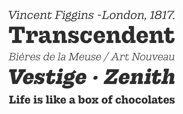
A sturdy slab serif with pronounced ink traps and diagonal terminals, spanning eight weights plus a variable font.
About
Gintona combines thick serifs and ink traps as a deliberate stylistic resource, its diagonal terminals and organic shapes giving it a warm, dynamic presence. It runs from delicately refined to bold and heavy across eight weights, suited to editorial work, logos, packaging and advertising.
Classification
A slab serif with thick serifs and pronounced ink traps used as a stylistic device, plus diagonal terminals that give it organic warmth.
Weights
LightExtraLightRegularMediumSemiBoldBoldExtraBoldBlack
Family
Languages
LatinLatin Extended
Tags
slabeditorialbrandingpackagingvariable