 MegaMegaTypeType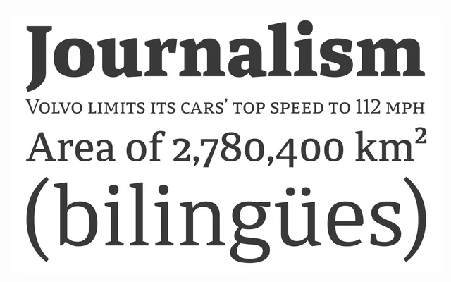
A compact, low-contrast serif built for newspaper and book text, with open counters and a generous x-height.
About
Calicanto is Alejandro Freitez's first commercial typeface, built on strong serifs, a vertical stress axis and slightly condensed proportions that suit dense-setting news and editorial work. Twelve variables each carry 750 glyphs across more than 90 languages, with small caps, ligatures and both lining and old-style figures for demanding text composition.
Classification
A compact serif with a vertical stress axis, symmetrical curves and low contrast, designed specifically for newspaper and book text rather than display use.
Weights
LightRegularMediumSemiBoldBoldExtra Bold
Languages
LatinLatin Extended
Tags
serifeditorialnewspaperbook-designtext