 MegaMegaTypeType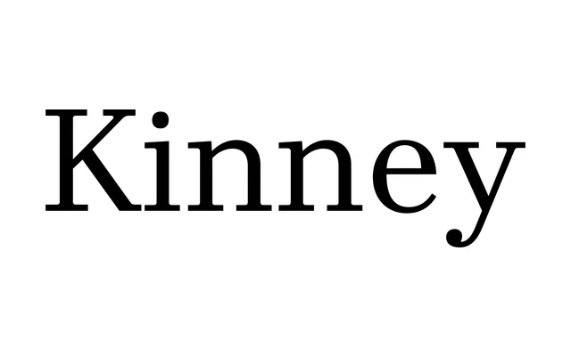
A plain, legible serif modelled on C.H. Griffith's Mergenthaler newspaper faces, built as a serif alternative to the neutral sans serifs that dominate that space.
About
Kinney fills a gap Montalbano saw for a neutral, legible serif in the mould of C.H. Griffith's newspaper designs for Mergenthaler. It was originally developed with e-book screens in mind, and deliberately avoids overt personality in favour of strength and clarity. Six weights from Book to Heavy each include an italic, with small caps, ligatures and a range of figure styles.
Classification
Modelled on C.H. Griffith's Mergenthaler newspaper faces. Built deliberately plain and legible rather than characterful, and originally developed with e-book screens in mind. Recategorised here as serif rather than the original brief's Sans label, since the designer explicitly calls it a serif.