 MegaMegaTypeType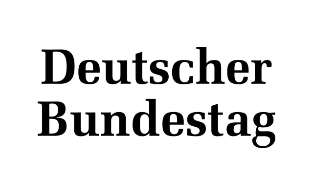
Hermann Zapf's Melior, first conceived in 1948 for newspaper legibility, was adopted by the German Bundestag in 2009 as part of a comprehensive parliamentary identity redesign by Büro Andreas Uebele.
About
Melior's letterforms are built on oval shapes fitted as closely as possible within rectangles – drawn freehand with a brush rather than constructed geometrically – producing an eye-guiding rhythm suited to small point sizes. Its design principles were later validated by the mathematical concept of the superellipse, coined by Piet Hein. The Bundestag's adoption of Melior pairs these qualities with the Federal Eagle, prioritising clarity and readability as expressions of democratic accessibility.
Classification
Melior is a humanist serif rooted in superelliptical letterforms drawn freehand by Hermann Zapf, with oval shapes fitted closely inside rectangles to aid legibility at small sizes – placing it firmly in the humanist serif tradition with transitional qualities.