 MegaMegaTypeType
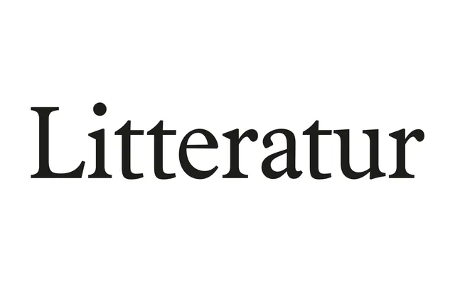
A crisp old-style serif by Arve Båtevik that brings back the warmth of Norway's golden-age literary anthologies.
About
Litteratur takes its cue from the sturdy book faces used in Norwegian anthologies when Ibsen, Hamsun and Undset were in print, and redraws that feel with sharper, modern detailing. A large x-height and short extenders fit more text into tight measures, and special ligatures smooth the rhythm of Nordic languages. It comes in seven weights from Light to Black, each with an italic, with small caps, several figure styles and coverage for Nordic, Sami and Baltic languages.
Classification
An old-style serif modelled on the sturdy book faces of Norwegian literary anthologies from the late 19th and early 20th centuries, with Nordisk Antikva and Plantin as reference points. This is the standard, higher-contrast member of the family; Litteratur Text is the low-contrast companion.