 MegaMegaTypeType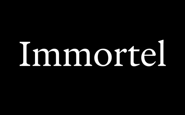
A four-variant text serif structured around the Hippocratic humours, each subfamily drawing from a different century of French type history while sharing identical metrics for seamless editorial interchange.
About
Developed at ANRT Nancy from 2016 and released by 205TF in 2021, Immortel organises its four subfamilies — Infra, Colera, Vena, Acedia — around the bodily humours rather than conventional weight gradations, each referencing a distinct historical engraver: Granjon, Jannon, Rosart and Dürer. Consistent set widths across all variants allow one to stand in for another without disrupting layout, while Infra and Vena offer two grades and a Median italic alongside a full cursive for fine editorial control. The family spans 16 static styles and six variable fonts with support for over 200 languages.
Classification
A four-variant text family organised around the Hippocratic theory of humours rather than conventional weight gradations: Infra (phlegmatic, after Granjon's 16th-century Gros Cicéro), Colera (choleric, after Jannon and Ganeau's Vendôme), Vena (sanguine, after Rosart's 18th-century work), and Acedia (melancholic, synthesising Dürer's Melencolia I). All four variants share identical set widths, x-heights, ascenders and descenders, enabling direct substitution without layout disruption. Infra and Vena each offer two grades — G1 and G2 — providing tonal variation for different papers and printing conditions while preserving line length. A dual italic system appears in Infra and Vena: Median (slightly inclined, for extended reading) and Italic (sharper angle with ornate details). Available as 16 static styles and six variable fonts.