 MegaMegaTypeType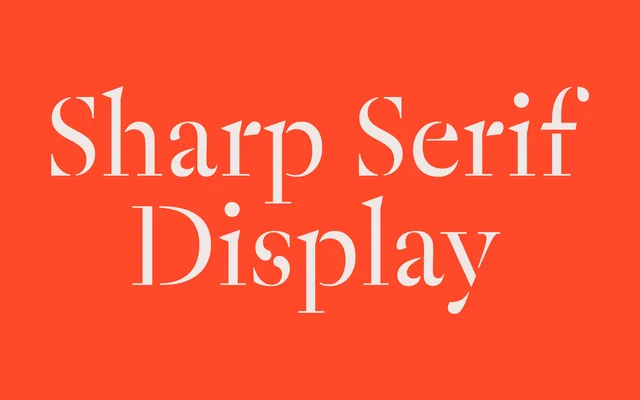
Sharp Serif Display pushes high-contrast serif conventions to their logical limit by eliminating hairlines entirely, drawing on stencil-constructivist letterform traditions for a bold, contemporary display face.
About
Sharp Serif Display is the display companion to Sharp Serif Text, taking high-contrast serif conventions to a radical extreme – the hairlines are dialled to the point of disappearance, leaving letterforms that read as part constructivist stencil, part refined editorial serif. The approach draws on vernacular stencil type traditions and the precedent Paul Barnes set with Dala Floda. It works as a standalone display typeface or as a dramatic foil to its more restrained text sibling.
Classification
High-contrast display serif taken to a constructivist extreme: hairlines are dialled down to the point of disappearance, borrowing from stencil letterform traditions. Part of the Sharp Serif Superfamily as the display optical size companion to Sharp Serif Text. Draws explicit influence from Paul Barnes' Dala Floda. Vertical stress, strong serifs, near-monoline construction in the thinner strokes. Proportional lining figures. Extensive Latin Extended glyph set; PanEuro variant adds Greek and Cyrillic.