 MegaMegaTypeType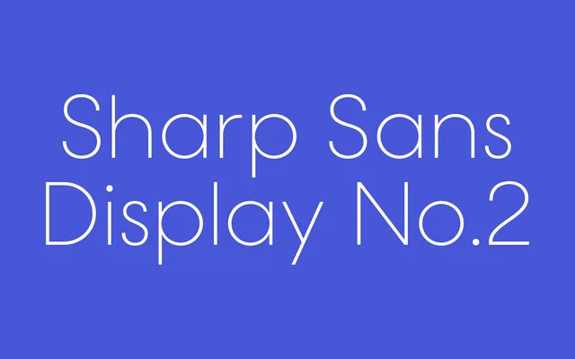
The second of two preserved display variants from Sharp Type's original Sharp Sans design, distinguished by true drawn italics and proportions tuned for headline scale.
About
Sharp Sans Display No.2 is a display-optimised geometric sans-serif from Sharp Type, preserved when Lucas Sharp redrawn the Sharp Sans family in 2016. Where the updated Sharp Sans moved forward, Display No.2 kept the proportions and character of the earlier design, including proper drawn italics rather than slanted romans. It sits alongside Display No.1 as a companion cut, both intended for large-scale headline and branding use where the true italic forms give typographers more expressive range.
Classification
One of two display sub-families preserved from the original Sharp Sans design when the family was redrawn in 2016. Geometric in structure with a humanist undertow. Specifically distinguished by drawn true italics rather than obliques, which set it apart from the redesigned Sharp Sans released the same year. Display-optimised spacing and proportions intended for headline and large-scale use.