 MegaMegaTypeType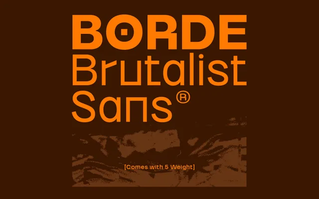
A five-weight brutalist sans serif drawing on raw architectural forms, with genuine optical range from Light to Black.
About
Borde takes its cues from concrete, steel and exposed structure, producing a sans serif with confrontational presence and confident proportions. Five weights from Light to Black give it real range across editorial and branding work, and a 498-glyph set includes diacritics, alternates and five numeral styles. No italic or condensed variants exist, which suits its single-minded architectural character.
Classification
Wide geometric sans serif with brutalist inflections; confrontational optical weight even in lighter cuts; no humanist softening; confident proportions derived from raw architectural references rather than classical type models
Weights
LightBookMediumSolidBlack
Languages
Latin Extended
Tags
brutalistgeometricheadlineeditorialbrandingposterpackagingarchitectural