 MegaMegaTypeType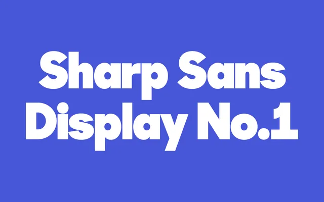
A geometric sans-serif designed for display use, with higher stroke contrast and optically refined spacing built for headlines and large-format settings.
About
Sharp Sans Display No.1 is the headline companion to Sharp Type's text-facing Sharp Sans No.1, tuned with higher contrast and tighter optical adjustments for use at large sizes. The face follows geometric construction principles — circular bowls, near-monolinear strokes at body scale that open up with display refinements — while staying eminently readable across editorial, brand and motion contexts. Five weights with italic companions give enough range for layered typographic hierarchies.
Classification
Geometric sans-serif optimised for display use at large sizes; features higher stroke contrast and more refined optical spacing than its text companion Sharp Sans No.1; draws on mid-century European geometric tradition (Futura lineage) while maintaining Sharp Type's characteristically clean, contemporary approach. The Display designation signals optical tuning for headline and large-format settings rather than body copy.