 MegaMegaTypeType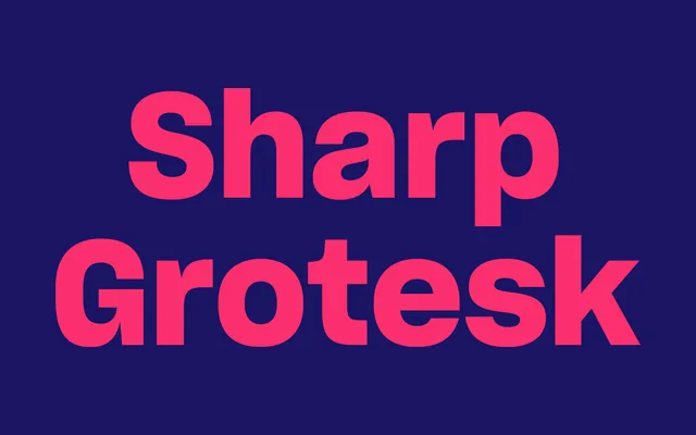
Sharp Type's flagship neo-grotesque: 21 widths, seven weights, and over 250 fonts drawing on 19th-century American wood type and Frutiger's systematic rigour.
About
Sharp Grotesk is a neo-grotesque family built from the traditions of 19th-century American wood type, reinterpreted through the systematic discipline of Adrian Frutiger's design process. It spans 21 width variants each in seven weights, with italics across most widths, giving designers a wide tonal range from tight condensed display to open editorial body setting. Extended in 2023 to cover Greek, Cyrillic, Thai and Hangul alongside the original Latin, it stands as one of the most complete grotesque families in contemporary use.
Classification
Neo-grotesque sans-serif rooted in 19th-century American wood type traditions and reinterpreted through Adrian Frutiger's systematic design methodology. Spans 21 width variants each in seven weights with italic support across most widths — an unusually broad tonal range for a single grotesque family.