 MegaMegaTypeType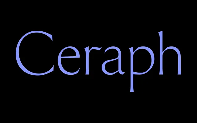
A display flared serif by Emma Piercy that pairs Roman inscriptional capitals with calligraphic lowercase forms, released through Sharp Type in 2024.
About
Ceraph began as a sketch in 2018 and was officially released through Sharp Type in November 2024. Its flared stroke endings give the letterforms an engraved, chiselled quality, while the uppercase draws on classical Roman proportions and the lowercase follows a calligraphic logic. At two styles – Regular and Italic – it is lean on weights but precise in character, aimed at display and titling work that wants both presence and refinement.
Classification
Sharp Type describe Ceraph as a "contemporary display semi-serif". The flared stroke endings produce an engraved quality distinct from traditional bracketed serifs. Uppercase proportions reference classical Roman inscriptional capitals; lowercase draws from calligraphic practice. Influenced by Hermann Zapf, Giovan Francesco Cresci, Jakob Erbar and Canela. The name fuses "seraph" and "serif".