 MegaMegaTypeType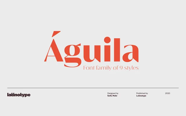
A nine-weight display typeface by Sofia Mohr that blends Didone contrast with semi-serifs and triangular geometric details for a distinctive editorial presence.
About
Aguila is built on a combination of straight lines, curves and triangular shapes drawn from the Didone tradition, with semi-serifs added as a defining structural detail. The result is a high-contrast display face suited to editorial, packaging, branding and broadcasting contexts. Nine weights from Thin to Heavy provide range across a single upright family, with coverage for over 200 Latin-based languages via 400+ characters.
Classification
Aguila combines Didone contrast with semi-serifs and geometric triangular elements, placing it firmly in display territory. The high contrast and editorial intent align it with the Didone tradition, though the triangular shapes and semi-serif details give it a hybrid, contemporary character.