 MegaMegaTypeType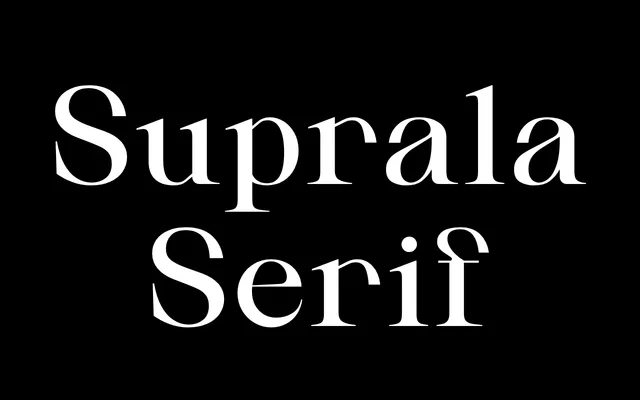
A high-contrast editorial serif in roman, italic and condensed, aimed at publishing, branding and cultural work that needs one voice across several proportions.
About
Suprala Serif pairs sharp stroke contrast with a classical skeleton and cleaner detailing, so it reads with authority without tipping into decoration. Four weights from Light to Ultra each come in roman, italic and condensed, twelve styles in all. The condensed cut gives the family real hierarchy in tight headline space while keeping the same character as the text styles.
Classification
A high-contrast serif built on a classical structure with cleaned-up detailing, sitting between traditional book faces and contemporary editorial display serifs rather than reviving any one historical model.
Weights
LightRegularBoldUltra
Optical sizes and widths
standardCondensed
Family
Suprala Serif Condensed
Languages
Latin
Tags
high-contrasteditorialpublishingbrandingpackagingculturalcontemporarycondensed