 MegaMegaTypeType
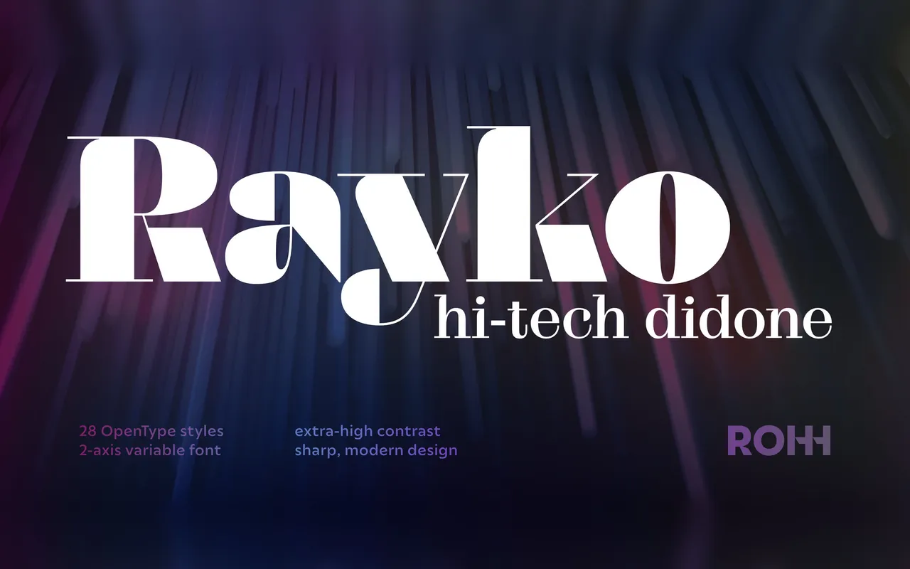
A contemporary didone by Roch Modrzejewski with extreme stroke contrast and abrupt ball terminals, available in 28 styles across four optical sizes and a two-axis variable font.
About
Rayko takes the classical didone tradition and pushes it into sharper, more angular territory with maximum contrast between thick and thin strokes. Four optical sizes – Text, Display, Headline and Poster – each with seven weights ensure the family performs across body copy and large-scale display settings. A two-axis variable font file covering weight (300–900) and optical size (16–144) gives designers continuous control within a single file.
Classification
A contemporary didone characterised by extreme stroke contrast, sharp ball terminals and high-precision letterforms. The family spans four optical sizes and seven weights, pushing the classical high-contrast serif tradition towards a futuristic, editorial direction.