 MegaMegaTypeType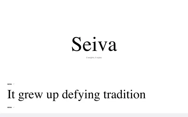
A high-contrast serif by Ana Laydner that evolves from Didone origins into something organic and expressively Brazilian, using variable font technology to shift exuberance at large sizes toward legibility at text sizes.
About
Seiva retains the extreme stroke contrast of Bodoni and Didot while growing away from strict classical structure, with delicate hairlines set against voluminous, organically shaped strokes. Three optical size grades – Regular, Display and Poster – are delivered through variable font axes, pruning decorative intensity as size decreases. The italics introduce vivid stylistic alternates that the foundry attributes to the richness of Brazilian botanical diversity.
Classification
Seiva draws on the extreme stroke contrast of Didone models such as Bodoni and Didot but departs from strict classical conventions, developing organic, expressive forms that vary in detail across optical sizes via variable font axes. Its dramatic contrast and display orientation place it firmly in the high-contrast serif category.