 MegaMegaTypeType
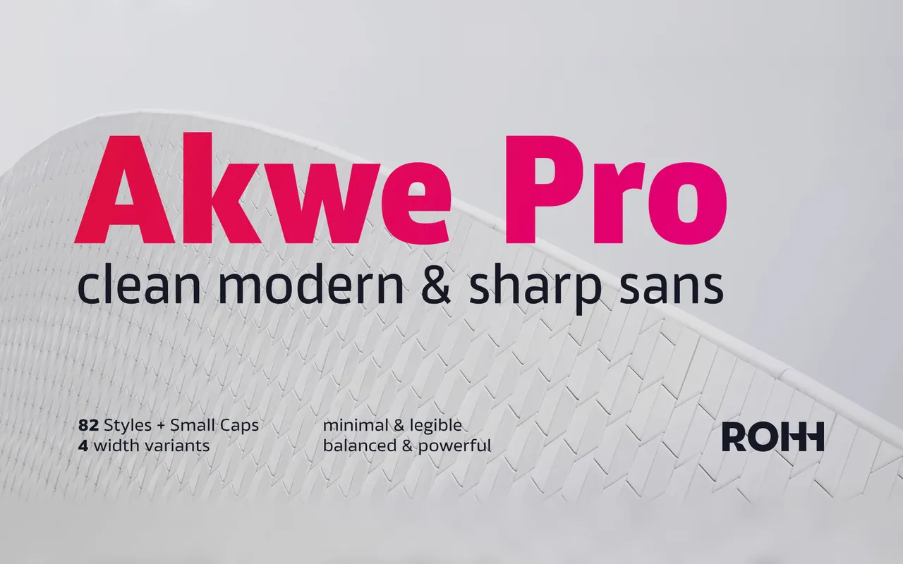
A clean neo-grotesque released in 2017 by Roch Modrzejewski, spanning four widths and six weights with matching italics and small caps across 164 styles.
About
Slightly squared curves distinguish Akwe Pro from plainer grotesques, giving the family a sharp, contemporary edge without departing from rational construction. Four widths – Condensed, Narrow, Normal and Extended – combined with six weights and italic counterparts make it practical across branding, interface and editorial contexts. An extensive OpenType feature set includes small caps, oldstyle figures, stylistic alternates and contextual substitutions, supporting over 90 Latin-based languages.
Classification
A modern grotesque with slightly squared curves and clean construction, placing it firmly in the neo-grotesque tradition with geometric influences. The crisp, precise letterforms and four-width system are consistent with contemporary grotesque design practice.