 MegaMegaTypeType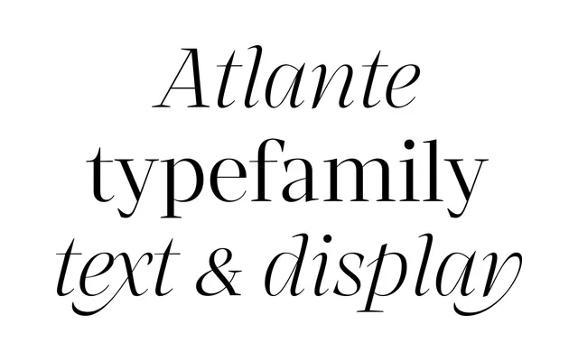
A high-contrast serif family from Yorlmar Campos and Martín Sesto, blending flat-pen and flexible-pen traditions across 36 styles and two variable fonts for both display and text use.
About
Atlante draws simultaneously from baroque, Garalde, transitional and modern type history, using the formal tension between flat-pen construction and flexible-pen contrast to produce a hybrid with a strong individual character. The family splits into 18 display and 18 text styles, with variable font versions covering both, making it equally suited to editorial, branding and screen use. It has received recognition from TDC, D&AD, the Clap Awards and TiposLatinos 2023.
Classification
Atlante draws from baroque, Garalde, transitional and modern traditions, shaped by both flat pen and flexible pen influences. This hybrid approach places it closest to transitional serif territory, with high contrast and a broad stylistic range across display and text cuts.