 MegaMegaTypeType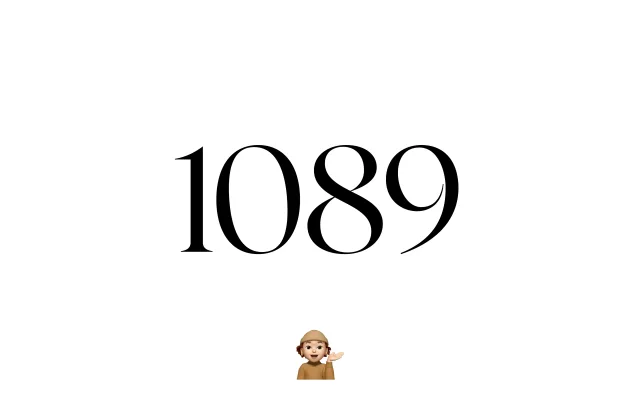
A two-style transitional serif drawing on Fleischman's 18th-century roman types, distinguished by angular cuts within rounded forms and sharp stroke contrast.
About
FH 1089 interprets the calligraphic refinement of Baroque serif typography, with particular attention to lowercase details reworked for contemporary clarity. The family comprises Regular and Regular Italic only, keeping the offering lean but purposeful. Sharp contrasts and angular incisions within otherwise rounded forms give it a distinctive tension between historical source and present-day precision.
Classification
Inspired by Fleischman's 18th-century roman types, FH 1089 sits firmly in the transitional serif tradition, characterised by high stroke contrast, precise construction and calligraphic detailing drawn from Baroque letterform conventions.