 MegaMegaTypeType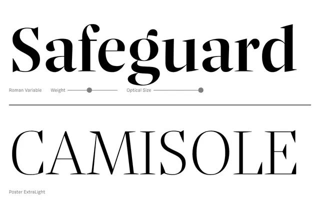
A four-optical-size serif family that distils baroque detailing – twisted drops, sprawling curves, idiosyncratic serifs – into a disciplined, contemporary structure across seven weights with matching italics and variable font support.
About
Nice spans Poster, Headline, Text and Micro optical sizes, each tuned for its intended use, from large-scale display work down to small-print reading. Seven weights with italics are available across all four sizes, and the family ships as variable fonts for both Roman and Italic. Baroque ornamental character is present but carefully calibrated, preventing decorative excess from compromising legibility at any scale.
Classification
A serif with baroque roots – sprawling curves, twisted drops and idiosyncratic serifs – consciously restrained and integrated into a modern design framework. The four optical sizes (Poster, Headline, Text, Micro) and seven weights place it firmly in the transitional serif tradition.