 MegaMegaTypeType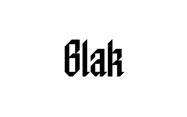
A geometric display blackletter that strips fraktur back to a strict grid, available in five widths across upright, slanted and backslanted cuts plus a two-axis variable font.
About
Blak takes the structure of blackletter and removes everything calligraphic, applying pure geometry and strict design rules in its place. The result is a bold, modular display face that reads as a contemporary design system rather than a historical revival. Fifteen static fonts span five widths from Tight to Zoom across three style variants, with a variable font (Blak Flex) adding a Weight axis alongside Italic.
Classification
Neoclassical blackletter stripped of decorative elements and rebuilt on strict geometric principles. Five widths (Tight to Zoom) across three style variants (upright, slanted, backslanted), plus a two-axis variable font. The geometry is absolute – no optical corrections, no calligraphic softening – giving it an industrial, modular feel closer to a grid system than traditional fraktur.