 MegaMegaTypeType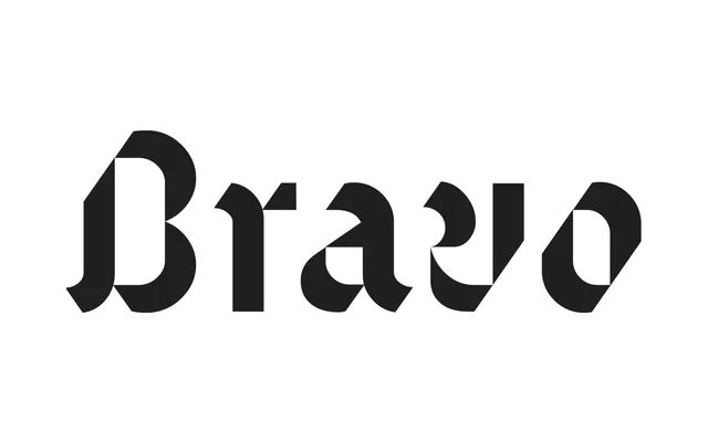
Gareth Hague's 1995 blackletter strips the genre back to geometric, diagonal-sliced forms that sit as comfortably in contemporary branding as in typographic art.
About
Distributed by Alias, Text reimagines blackletter through a modular, geometric lens: thick strokes are cropped with consistent diagonal slices, counters open into triangular negative spaces, and calligraphic 'flags' twist off lowercase terminals. Two weights exist — a Regular and a Stencil cut where strokes narrow to near-disappearing points. The result reads equally well in all-caps and lends itself to motion and compositional play off its repeating angles.
Classification
A blackletter typeface that strips away traditional Fraktur excess in favour of geometric, modular construction with diagonal slice cuts and controlled calligraphic strokes, evoking Fraktur while absorbing influences from Latin sans-serif forms.