 MegaMegaTypeType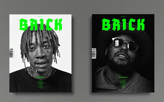
A stripped-back blackletter derived from Fraktur sources, with grotesque-influenced redrawing of the most problematic letterforms to make it viable for all-caps setting and modern editorial use.
About
Built on the same adhesive-tape construction methodology as its predecessor Adhesive Nr. Seven, this face replaces the heavy texture with a neutral, clean aesthetic. Majuscules derive from Tannenberg Fett and minuscules from Robert Koch's Schmale Deutsche Anzeigenschrift, while letters historically difficult to read in Fraktur – including F, H, K, Z and several lowercase letters – were redrawn with grotesque influences. The result is a blackletter that functions where the genre typically fails, including all-capitals text setting.
Classification
A cleaned-up blackletter built on Fraktur foundations – specifically the Tannenberg Fett majuscules and Schmale Deutsche Anzeigenschrift minuscules – with grotesque influences introduced on historically problematic letterforms to improve legibility.